(Bloomberg) —
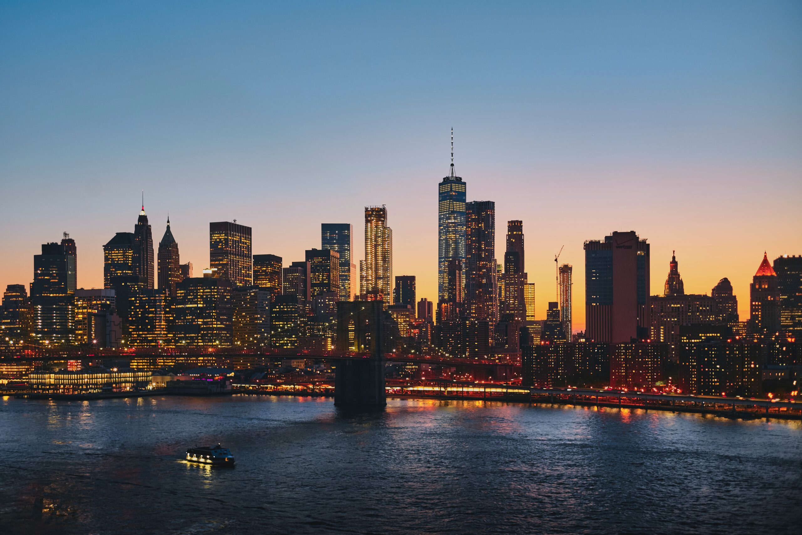
The smog settling in the sky above eastern North America, created by smoke billowing from hundreds of wildfires in Canada, made the air quality in New York City and Toronto among the worst in the world on Wednesday. The campfire smell and apocalyptic haze are eerily familiar to residents of the American West who have had similar experiences during fire seasons past. But now, residents down the East Coast as far south as Georgia and into the Midwest are confronting the smoky conditions — some for the first time. And many are turning to a growing collection of apps and maps to help gauge the risks in their particular location, down to the neighborhood level.
Air quality sensors, which measure the local air quality index (AQI), can help quantify the severity of nearby pollution and guide behaviors to protect against adverse health effects. As wildfire season gets more destructive and its impacts are felt in new places, a growing number of these tools are being installed everywhere from private homes to government sites. Those who don’t have their own sensors can find crowdsourced maps online. The more people contribute data, the less likely there are to be information gaps.
“Until you actually experience wildfire smoke, and the devastating nature of dense wildfire smoke, you don’t really understand what you need to know, and how you need to know things to get away from it,” said Adrian Dybwad, the founder and CEO of PurpleAir, which sells consumer-grade AQI monitors for around $200 to $300.
“For instance, in California, people are used to looking at the PurpleAir map to decide where they need to go to escape the smoke for a bit. Or if they should just hunker down and get their air cleaners going in their house.”
The company has supplied citizen scientists with a network of more than 23,000 softball-sized air quality sensors that can be deployed inside or outside. Together, they power a public real-time map covered with colorful dots ranging from green (good to go) to red and purple (stay inside!) that appear in countries across the world.
On Wednesday, the East Coast looked like an angry bruise. Some neighborhoods in Manhattan saw readings that exceeded 350 AQI; in Columbus, Ohio, readings approached 150.
“The smoke has kind of stayed on the west side of the country for the most part. But right now, if you look at the PurpleAir map, you will notice it’s almost like the East and West Coasts have swapped,” said Dybwad.
While there are more sensors on the West Coast — around seven for every one in New York, says Dybwad — that could change as people in other parts of the US experience extreme weather events.
During 2020 fire season, traffic to the site jumped 1,000% from its typical weekly average, the company told CityLab that year; the map had about 500,000 daily hits coming out of California as West Coast fires raged. Dybwad doesn’t have updated data for this year, but says typically he sees a four- or five-fold increase in viewership during events like this — and a jump in sensor sales.
The Environmental Protection Agency and the US Forest Service launched their own Fire and Smoke Map in 2020, which uses adjusted data from PurpleAir products along with about 1,000 government-operated, regulation-grade sensors. Accessible on the EPA’s online platform, AirNow allows you to type in your zip code and get a real-time AQI reading; their map also shows active wildfires and local sensors.
Looking at several sources can give you a better picture of the situation in the sky. “While government equipment is more accurate and less prone to user error, its coverage is not as widespread in many areas, nor does it update as frequently as PurpleAir,” CityLab reported in 2020. One study by EPA researchers found PurpleAir data tended to overestimate particulate matter by around 60%.
The difference in the granularity of the data is in part by design. The government’s air quality sensors are highly regulated, high-price machines, meant to provide data that can support and enforce clean air legislation, while the cheaper PurpleAir sensors can, when taken in aggregate, help people make everyday decisions about how to spend their days safely, and manage health problems like asthma.
“People are curious about air quality around and at their house,” said Dybwad. “So it’s all around people making decisions, even things like, ‘Where should I go cycling?’”
Deploying more sensors per mile can produce better information in areas where there is wide topographical variation, says Benjamin Clark, a public policy and planning professor at the University of Oregon who researches citizen science. He has found that in several states, areas with fewer resources and more residents of color tend to have worse access to sensors. “There is an economic component, an environmental justice component to this: the availability of that information is much better for people who are whiter and wealthier,” he said. “Because most of these sensors have been purchased by individuals, not by governments.” That matters because the information can impact decision-making at the public health and the personal level.
Other apps like IQAir’s AirVisual and AirCare also present AQI data in an easy-to-read format on your phone screen. And scientists with the New York State Mesonet, a statewide weather-tracking network operated by the University at Albany, use Doppler LiDAR and a microwave radiometer to report air quality information from 17 sites around the state.
The readings provide guidance on whether it’s necessary to take precautions like limiting outdoor exposure or wearing a high-quality mask, as New York City urged residents to do in an advisory issued on June 7. They’re even more crucial on days the sky isn’t orange, and the threat in the air is invisible. “People can still partake in really dangerous activities when the air quality is bad, and you don’t know it,” said Clark. “I think that’s where having something like an AQI can be really helpful — so long as you know how to interpret it.”
An AQI of 0 through 50 is considered to be “good” air quality, according to the EPA, which established the AQI standard. Once the levels hit 101, air quality starts being considered unhealthy for sensitive groups; by 151, it’s unhealthy for everyone. Between 201 and 300 — a range that New York City hit on June 6 — the EPA warns that the air is considered “very unhealthy” to breathe. Above 300, a range that New York City hit on June 7, it’s hazardous.
The myriad health effects to the lungs and heart can be both short-term and long-term, including everything from temporary breathing problems and headaches to death.
- Read more: How Wildfire Smoke Impacts Human Health
“Smoke from wildfires is increasingly recognized as a major health threat,” said Paige Fischer, an associate professor at the University of Michigan and lead scientist at the university’s Western Forest and Fire Initiative. “Now, both health-compromised and healthy populations are suffering the effects of smoke far from the origins of the problem.”
To contact the author of this story:
Sarah Holder in New York at sholder6@bloomberg.net
© 2023 Bloomberg L.P.